
Sans Forgetica, the font designed to improve your memory
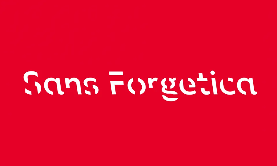
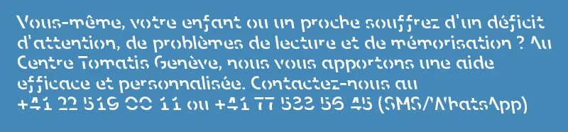
A new font called Sans Forgetica has been designed by Australian researchers as a memory aid for reading. It is based on a theory called “desirable difficulty”, which holds that people remember things better when their brain has to overcome small obstacles while processing information. Sans Forgetica is sleek and slants backwards (reverse italics), with gaps in each letter that make the reader work a little harder, according to Stephen Banham, a designer and lecturer at RMIT who helped create the font.
Updated on , a 4-minute read.
On this page
A new font can help your brain take in information more deeply, researchers say, and there is nothing magic about it: it is the science of effort.
Source (in English): https://www.washingtonpost.com/business/2018/10/05/introducing-sans-forgetica-font-designed-boost-your-memory/
Psychology and design researchers at RMIT University in Melbourne have created a font called Sans Forgetica, designed to help readers retain information. It is based on a theory called “desirable difficulty”, which suggests that people remember things better when their brain has to overcome small obstacles while processing information. Sans Forgetica is sleek and slants backwards (reverse italics), with gaps in each letter that act as a “simple puzzle” for the reader, according to Stephen Banham, an RMIT designer and lecturer who helped create the typeface.
“It should be hard to read, but not too hard,” said Banham. “By requiring that extra act, memory is more likely to be triggered.”
In designing Sans Forgetica, Banham said he had to go against his instincts, built up over 25 years of studying typography. Clarity, ease of processing and familiarity are usually the guiding principles in the field. The reverse italics of Sans Forgetica are unfamiliar to most readers, since backward-slanting type is generally used only by cartographers to mark rivers. As for the gaps in the letters, they make the brain think, because it has to work out the shapes.
The team tested how well this font worked, along with other deliberately difficult fonts, with 400 experienced students, in the laboratory and online. It found that “Sans Forgetica departs far enough from design principles without becoming too illegible, and it aids memory”, according to a press release on the university's website.
A logical continuation of Oppenheimer's work
In some ways, Sans Forgetica continues the work of Daniel Oppenheimer, a professor of psychology at Carnegie Mellon, who put forward a similar idea about “desirable difficulty”, called “disfluency”, while working at Princeton University in 2011. The terms are different, but the principle is the same: a little mental gymnastics helps readers remember things better.
Oppenheimer's team relied on contrast and size, rather than an unusual font, to create mental obstacles. In one experiment, the team asked 28 university students to read information about two made-up creatures, the pangerish and the norgletti. The pangerish information was printed in grey, in 12-point Comic Sans or Bodoni. The norgletti profile was printed in black 16-point Arial.
The team distracted the students for 15 minutes after they had read about the animals, then tested them. The students remembered 87% of the pangerish facts, the information that had been harder to read, and 73% of the norgletti facts.
Oppenheimer and his team extended their research over a semester at a secondary school in Chesterfield, Ohio. In several classes and subjects, they changed the fonts of the teaching materials (handouts, PowerPoint slides and worksheets) to unusual ones, such as Comic Sans Italic, Monotype Corsiva and Haettenschweiler. After several weeks of teaching, the researchers found that in every subject except chemistry, the students who had read the “flawed” materials did much better.
“This research shows that behavioural interventions can be an important part of school reform,” Oppenheimer said in an interview with Harvard Business Review.
Sans Forgetica is the first font created for memory, the RMIT researchers said. But Janneke Blijlevens, another researcher on the project, stressed that the font should be used sparingly to stay effective. If the reader's brain gets used to it, it will decode Sans Forgetica as easily as Arial or Times New Roman, the most widely used fonts in the world.
“We think it is better used to highlight key sections of a text, such as a definition, rather than to convert whole texts or books,” Blijlevens told the Washington Post.
An ideal combination for active work with the Forbrain device
Combining the Sans Forgetica font with the Forbrain device looks promising: the principle of “desirable difficulty” would add to the work of the audio-vocal loop, and learning and memory would be strengthened by the decoding required on the visual side.
Want to try it for yourself? Sans Forgetica is available as a Google Chrome extension on the RMIT website.
In their own words
“Kevin was very receptive, even though classical music wasn't really his favourite kind of music.”
“This is the result of your support and your method, which really took a weight off my mind and helped Hakim move forward and gain confidence in himself.”
“My dad and my friends tell me I've become more mature, that I express myself much better, that my questions are more thought through.”